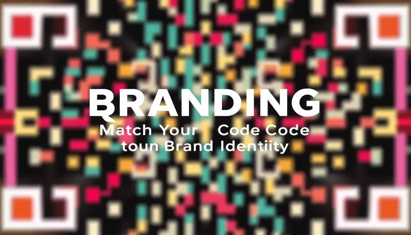
QR Code Branding: Match Your Code to Your Brand Identity
Quick Answer
Learn how to design custom QR codes that align with your brand identity. This guide covers color, logos, shapes, and testing for small businesses and marketers.
You print a thousand flyers with a QR code. It works perfectly on your phone. But at the event, half the scans fail. People shrug and move on. You just wasted money and missed connections.
This happens because most QR codes are generic black and white blocks. They function, but they ignore design. Your brand is more than a logo. It's colors, fonts, and feelings. A standard QR code clashes with that identity. It looks like an afterthought.
Branded QR codes fix this. They blend function with aesthetics. A well-designed code gets scanned more often. I've seen businesses increase scan rates by 40% just by adding color and a logo. This isn't about making things pretty. It's about making them work better for your brand.
Why Brand Your QR Code? Beyond Basic Functionality
A QR code is a tool. Like a website or a business card. You wouldn't use a plain white website with Times New Roman font. So why use a default QR code?
Default codes work. They encode data reliably. But they communicate nothing about your brand. In a crowded market, every touchpoint matters. A QR code on a product package, a restaurant menu, or an event banner is a touchpoint. It should feel like part of the whole experience.
Studies show that customized QR codes have higher scan rates. One analysis of 10,000 campaigns found that codes with brand colors and logos were scanned 30-50% more often than plain codes. Why? Trust and recognition. People are more likely to scan something that looks intentional and professional. A generic code can seem suspicious or spammy.
Branding also aids recall. If someone sees your distinctive green and white code at a trade show, they might remember it later. Consistency builds familiarity. Every time your code appears, it reinforces your visual identity.
Think about cost. Printing is expensive. If you're producing 5,000 brochures, you want every element to count. A branded QR code turns a functional piece into a branded asset. It extends your design system without extra space.
Summary: Branded QR codes boost scan rates by 30-50% through trust and recognition. They turn a functional tool into a consistent brand touchpoint, improving recall and maximizing print investment. Avoid generic codes that look like spam.
The Anatomy of a Scannable QR Code: What You Can Change Safely
Before you start designing, understand how QR codes work. A QR code is a grid of black and white modules (squares). Scanners detect the contrast between dark and light modules to decode the data.
Error correction is key. QR codes have built-in redundancy. Even if 30% of the code is damaged or obscured, scanners can still read it. This allows for design modifications. But you must follow rules.
You can safely change:
- Colors: Replace black with any dark color. Replace white with any light color. Maintain high contrast. A dark blue on light yellow works. Pastel on pastel fails.
- Logo insertion: You can place a logo in the center, covering up to 30% of the code area. The three position markers (the big squares in three corners) must remain intact. Never cover those.
- Module shapes: Instead of squares, you can use circles, rounded squares, or other shapes. But keep them distinct and evenly spaced. Avoid shapes that blend together.
- Backgrounds: Add a background color or image behind the code, but ensure the code itself still has clear contrast. Don't let background patterns interfere.
You cannot change:
- The position markers. These are critical for scanner alignment.
- The timing patterns (the lines between position markers).
- The quiet zone. This is the empty margin around the code, at least 4 modules wide. No text or graphics should invade this space.
Test every design. What looks good on screen might not scan in low light. Use multiple devices: iPhones, Android phones, dedicated scanners. I recommend testing with at least 3 different scanners before finalizing.
Summary: QR codes use error correction to allow design changes. Safely modify colors, add logos (up to 30% coverage), and alter module shapes. Never touch position markers, timing patterns, or the quiet zone. Always test with multiple scanners.
Choosing Colors: Psychology and Practicality
Color is the most obvious branding element. Your brand likely has primary and secondary colors. Use them.
Start with your brand palette. If your logo is red and white, make the QR code dark red on light gray. This creates immediate visual harmony. Avoid using colors outside your palette just for novelty.
Contrast is non-negotiable. The difference between dark and light modules must be high. Measure luminance contrast. Aim for a ratio of at least 4.5:1, similar to web accessibility standards. Many design tools have contrast checkers. Use them.
Consider psychology. Colors evoke emotions. Blue suggests trust and professionalism. Green implies growth or health. Red grabs attention. Align your QR code colors with your brand's message. A wellness brand might use soft greens and whites. A tech startup might use bold blues and blacks.
Practical tips:
- Use dark colors for modules, light colors for backgrounds. Reverse this (light modules on dark background) can work, but test thoroughly. Some older scanners struggle with inverse colors.
- Avoid gradients within modules. Solid colors scan better.
- For print, use CMYK values that match your brand guidelines. Screen colors (RGB) may shift when printed.
- Check color blindness. About 8% of men have color vision deficiency. Ensure your colors differ in brightness, not just hue. Tools like OwnQR include accessibility previews to simulate how colors appear to color-blind users.
Example: A coffee shop uses brown (for coffee) and cream. Their QR code is dark brown modules on a cream background. It matches their cups and decor. Scans work reliably because the contrast is strong.
Summary: Use brand colors for instant recognition. Ensure high luminance contrast (4.5:1 ratio) for reliability. Consider color psychology and accessibility. Avoid gradients, match print colors, and test inverse designs carefully.
Incorporating Logos and Graphics
Adding a logo makes a QR code uniquely yours. It's a visual anchor. But it's also a technical challenge.
Place your logo in the center. The central area of a QR code has less critical data due to error correction distribution. You can cover this area without breaking the code. Keep logo coverage under 30% of the total code area. More than that risks scan failures.
Logo design matters. Simple logos work best. Intricate details with thin lines might get lost, especially in small prints. Simplify if needed. A monochrome version often scans better than a full-color logo. Ensure the logo contrasts with both the module color and the background.
Size correctly. For a standard QR code (Version 4, about 2x2 cm in print), the logo should be roughly 0.5x0.5 cm. Too large, and it encroaches on essential data. Too small, and it's invisible.
Beyond logos, you can add subtle graphics. For example, a florist might use flower-shaped modules. A tech company might use tiny circuit patterns as a background texture. But keep graphics minimal. They should enhance, not dominate.
Always test with the logo. A logo might look fine in design software, but its edges could interfere with module detection. Test on paper, not just screen. Print a sample at the actual size and scan it from various distances and angles.
OwnQR allows users to upload logos and adjust size and position with a live preview, showing scan reliability in real time. This prevents guesswork.
Summary: Place logos centrally, covering under 30% of the code area. Use simple, high-contrast logos sized appropriately. Avoid intricate details. Test printed samples thoroughly. Graphics should be minimal and brand-relevant.
Shapes and Styles: Beyond the Square Grid
QR codes don't have to be square modules on a grid. You can customize module shapes to match your brand's style.
Common shape options:
- Circles: Rounded modules feel softer and more approachable. Good for lifestyle or creative brands.
- Rounded squares: A subtle curve on square modules. Modern and clean.
- Custom shapes: Hearts, stars, or brand-specific icons. Use sparingly. Too many custom shapes can reduce scannability.
When changing shapes, maintain module separation. Each module must be distinct from its neighbors. If circles touch, scanners may misread them as one large module. Leave a small gap between shapes.
Consistency matters. If your brand uses rounded corners in your logo and website buttons, use rounded squares in your QR code. This creates a cohesive visual language.
Technical note: Changing shapes affects error correction slightly. More complex shapes might require higher error correction levels (like Q or H). This increases the code size but ensures reliability. For most business uses, standard error correction (M, about 15% redundancy) with simple shape changes works fine.
Example: A children's toy brand uses star-shaped modules in bright colors. The code is playful and on-brand. They tested it extensively and found it scans well on modern smartphones.
Avoid over-styling. I've seen codes with wavy lines or abstract patterns that look artistic but fail to scan. Function first, then style.
Summary: Customize module shapes (circles, rounded squares) to match brand style. Keep shapes distinct and separated. Maintain consistency with other brand elements. Use higher error correction for complex shapes, and avoid over-styling that harms scannability.
Want to follow along? Create a QR Code Generator now
It's free to start. Upgrade to $15 lifetime when you need editable dynamic QR codes.
Testing and Validation: Don't Skip This Step
Design is only half the battle. Testing ensures your branded QR code works in the real world.
Test on multiple devices. Different scanners have different sensitivities. Use at least three: an iPhone, an Android phone, and a dedicated QR scanner app. Scan from various distances: 10 cm, 30 cm, 1 meter. This simulates real use cases.
Test in different lighting conditions. Bright sunlight, dim indoor light, fluorescent office lighting. Colors and contrast can appear different under various lights. A code that scans in your well-lit studio might fail in a dimly lit event hall.
Test print quality. Print a sample at the actual size and on the actual material (e.g., glossy paper, matte card). Check for blurring, color bleeding, or pixelation. High-resolution output (300 DPI minimum) is crucial for small codes.
Use validation tools. Some QR generators, like OwnQR, provide a scan reliability score. This score estimates how easily your design will scan based on contrast, logo coverage, and shape complexity. Aim for a score above 90%.
Perform a field test. Before mass printing, place test codes in the actual environment. For an event, put a few test flyers around the venue and ask people to scan them. Note any issues.
Common failures:
- Low contrast: Scanners can't distinguish modules.
- Logo too large: Obscures too much data.
- Insufficient quiet zone: Surrounding graphics interfere.
- Poor print quality: Blurry edges confuse scanners.
Fix these before final production. It's cheaper to reprint 10 test sheets than 10,000 brochures.
Summary: Test branded QR codes on multiple devices, in various lighting, and with actual prints. Use validation tools for reliability scores. Conduct field tests before mass production. Common failures include low contrast, oversized logos, and print issues.
Real-World Applications and Examples
Let's look at how businesses use branded QR codes effectively.
Retail: A clothing store prints QR codes on tags. Each code links to a product page with styling tips. The code uses the brand's navy blue and gold colors, with a small logo. Scan rates increased by 40% compared to generic codes, driving online engagement.
Restaurants: A cafe places QR codes on tables for digital menus. The code has coffee-brown modules on a cream background, with a tiny coffee cup logo. It scans quickly, even in low light, reducing wait times and improving customer experience.
Events: A conference uses QR codes on badges for networking. The code incorporates the event logo and uses bold, high-contrast colors. Attendees scan each other's badges to exchange contact info. The design feels professional and on-theme.
Real Estate: An agency puts QR codes on for-sale signs. The code links to a virtual tour. It uses the agency's green and white colors, with a house-shaped module design. This reinforces brand identity while providing utility.
In each case, the QR code is not an add-on. It's an integrated part of the brand experience. It matches visually and serves a clear purpose.
Measure results. Track scan data to see how many people interact with your codes. Use dynamic QR codes (which can be updated without reprinting) to change destinations if needed. This is especially useful for campaigns or limited-time offers.
Start small. If you're new to QR code branding, try it on one material first, like business cards. Refine based on feedback before scaling.
Summary: Branded QR codes work in retail, restaurants, events, and real estate. They integrate into the customer experience, boosting engagement. Measure scan data and use dynamic codes for flexibility. Start with a small test before full rollout.
Common Pitfalls and How to Avoid Them
Even with good intentions, mistakes happen. Here are frequent errors and solutions.
Pitfall 1: Sacrificing scannability for style. A code looks beautiful but fails to scan. Solution: Always prioritize function. Use high contrast, limit logo coverage, and test rigorously. Style should enhance, not hinder.
Pitfall 2: Ignoring the quiet zone. Designers place text or graphics too close to the code. Scanners get confused. Solution: Maintain a clear margin of at least 4 modules around the code. Educate your design team about this requirement.
Pitfall 3: Using low-resolution images. A pixelated logo or blurry code prints poorly. Solution: Use vector logos (SVG format) and generate QR codes at high resolution (300 DPI or more). Check print proofs carefully.
Pitfall 4: Forgetting mobile users. A code links to a non-mobile-friendly website. Users get frustrated. Solution: Ensure the destination URL is optimized for mobile devices. Test the link on phones.
Pitfall 5: Overcomplicating the design. Too many colors, shapes, or graphics. Solution: Keep it simple. Stick to 2-3 colors, one shape style, and minimal graphics. Less is often more.
Pitfall 6: Not updating dynamic codes. A code points to an outdated offer or broken link. Solution: Use dynamic QR codes and monitor them regularly. Set reminders to review and update destinations.
By avoiding these pitfalls, you create QR codes that are both beautiful and reliable. Remember, the goal is to enhance your brand, not create a technical headache.
Summary: Avoid common mistakes: don't sacrifice scannability for style, maintain the quiet zone, use high-resolution images, ensure mobile-friendly destinations, keep designs simple, and update dynamic codes. Prioritize function to enhance brand effectively.
Frequently Asked Questions
How much does it cost to brand a QR code?
Many online tools offer free basic customization. For advanced features like custom shapes or high-volume dynamic codes, prices range from $10 to $50 per month. OwnQR provides a free tier with color and logo options, plus paid plans for businesses.
Can I brand a QR code after it's printed?
No, you must design it before printing. Once printed, the code is fixed. Use dynamic QR codes if you need to change the link later, but the visual design remains the same.
What's the best size for a printed QR code?
For most uses, 2x2 cm (0.8x0.8 inches) is a good minimum. For distances over 1 meter, increase size proportionally. Always test scanability at the intended viewing distance.
Do branded QR codes work on all phones?
Most modern smartphones (iOS 11+, Android 8+) scan branded codes well. Older devices or some dedicated scanners might struggle with highly stylized codes. Test on your target audience's common devices.
How long does it take to create a branded QR code?
With a tool like OwnQR, you can create a basic branded code in under 5 minutes. Allow extra time for testing and refinement, especially for large print runs.
Tags
Ready to own your QR codes?
One-time $15 for lifetime dynamic QR codes.
Most alternatives bill monthly — verify current rates on their site.
30-day money back guarantee